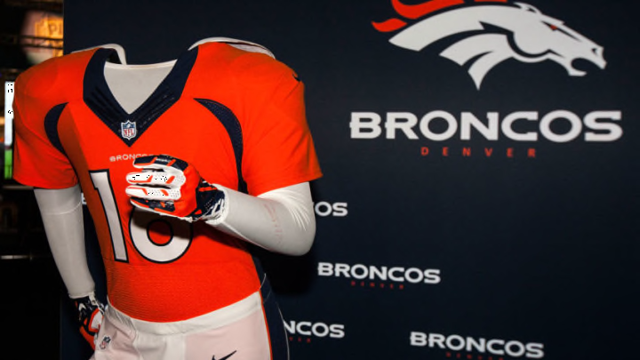
After seeing some of the work they are doing with other NFL teams, should the Denver Broncos get a uniform overhaul from Nike…
Nike is one of the best sports outfitting organizations in the world. That’s why they can afford to outfit every team in the National Football League.
Unfortunately, and with all due respect, Nike has done a horrible job of re-designing uniform looks for NFL teams. This is probably not a universal opinion, but it looks to me like Nike is ruining the look of the NFL one team at a time.
Hopefully, the Denver Broncos are not among their next victims.
Let’s look at some of the crazy design mistakes Nike has allowed NFL teams to put on an actual gameday platform:
Horrible.
https://t.co/cVjb1mJsEE The Jacksonville Jaguars' New Uniforms May Have Leaked And That Awful Helmet Is Finally Gone https://t.co/rzrUcLIxyi pic.twitter.com/1OnMV1c0wR
— Stalwart Cleaning - London (@londoncleaners2) March 7, 2018
What is that helmet supposed to be?
What is that font on the Buccaneers’ newest uniforms, digital clock?
I’m sorry, but Nike is failing the NFL. I cannot think of a uniform re-design so far that I like even a little bit, except for what they are doing with color rush uniforms.
As a matter of fact, you’d be hard-pressed to find a color rush uniform that doesn’t look better than every team’s weekly uniform. The Giants and Dolphins color rush uniforms, in particular, are very good looking.
Of course, this discussion all stems from the Tennessee Titans releasing their new look, which is horrible:
https://twitter.com/Titans/status/981699723282219008
Compare these Titans uniforms with the old Houston Oilers uniforms:
What's your favorite NFL uniform of All-time? I think mine is the 80s-90s Houston Oilers. pic.twitter.com/HOrRCvVkUa
— 𝙃𝙚𝙡𝙢𝙚𝙩 𝘼𝙙𝙙𝙞𝙘𝙩 (@HelmetAddict) February 19, 2018
More from Predominantly Orange
- Broncos chances of landing Sean Payton dwindling, but not gone
- Denver Broncos dream coaching staff for DeMeco Ryans
- Denver Broncos: “Sleeper” David Shaw checks every box
- The Broncos’ coaching search likely has not gone to plan
- Special Chiefs Suck Offer: Bet $5, Win $150 if Joe Burrow Passes for ONE YARD vs KC
These Oilers uniforms are very nice. First of all, this is a much better color scheme than the Titans are currently using. Dark and muted with futuristic design is a 10-year old uniform design tactic. Old-school, simple, and vibrant is what I want to see more of.
The Oilers uniform is far, far better than what the Titans are going to be wearing for the foreseeable future.
This brings me back to the point of this article, which is that if Nike is going to re-design the Denver Broncos’ uniforms, it had better be with the old school in mind.
The Broncos’ dark navy blue is out-dated in my opinion. Their uniform definitely needs updating, but this is the type of design that is on trend. No more of these fonts that will date themselves after one season. No more uniforms that just flat out look incorrect color-wise.
Every team that has had their uniforms re-designed by Nike has downgraded, in my opinion. Nike must stop trying to outfit the NFL in these weird, arena league, expansion team style uniforms and get back to the clean cut look of the past.
